The accessibility that’s often overlooked

By Matt Weinberg
Product Designer, Understood
One in five people in the US has a learning and thinking difference, like ADHD or dyslexia. But many designers don’t realize the ways they might be letting this substantial user base fall through the cracks — sometimes to the point where they can’t use a product at all.
Our product team puts the needs of these users front and center in everything we design. For our team, this approach has opened up new ways of thinking about digital accessibility. On top of our commitment to W3C WCAG and WAI-ARIA standards, we’ve found that designing specifically for learning and thinking differences helps us to build better products all around.
Often, our focus on these audiences leads us to decisions that feel a lot like basic best practice design principles. We see that as one more reminder that accessibility should be the starting point of any good design process, rather than something to check off at the end.
Here are a few of the ways our inclusion mindset finds its way into our design practices.
Designing products that are easy to read
Lots of users in our core audience have dyslexia, dyscalculia (a learning disability in math), or visual processing issues, so readability is always a top consideration.
In our layouts, we use left-alignment and spacious line height for text blocks. That helps to make line jumps more predictable and easier to follow. We keep line lengths relatively short, to help users keep track of location in the text. And while we underline links to differentiate them from surrounding text, we also bold them — for individuals with dyslexia or visual focus issues, underlining alone can be too subtle of a difference.
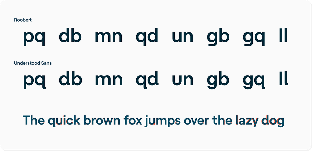
To improve the overall legibility of our products, we commissioned our own typeface called Understood Sans. The foundry that created it, Displaay, optimized their existing Roobert typeface to build on the individuation and familiarity of the letterforms. This approach can help users, including those with dyslexia, to differentiate similar-looking letters (“g” and “q”, “b” and “d”, “m” and “w”, and so on).

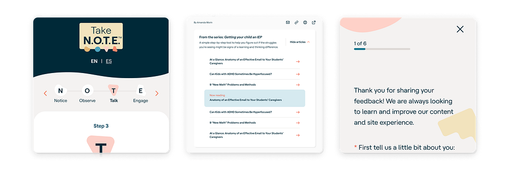
Users with dyscalculia might struggle with numerical progress indicators. So we make sure to incorporate visuals, like progress bars, next to any numerical indicators.

Another way we make our products more legible for all users is through careful color selection. Our brand color palette and color pairing guidelines were designed to comply with WCAG Level AA contrast standards, and in some cases they meet Level AAA.
Our website automatically detects and matches the user’s operating system preference for light mode or dark mode. In dark mode, rather than flat white on black, our body text uses cream on dark navy. That can reduce eyestrain for individuals with light sensitivity or other optical nerve issues.
Designing products to help the user stay focused
Some of our target users struggle with focus or attention issues. For example, a user with ADHD may find themselves avoiding a task because it seems insurmountable or time-consuming. Or they might become overwhelmed by too much content at once.
We kept these users in mind when we designed our article template. It displays key information above the fold, including highlights, context, and frequently a summary, with takeaways at the bottom of the article. This helps to set the user’s expectations and makes it easier to scan the main points of the article.
Our layouts favor large text and elements, with ample white space in between. That way, the amount of information we can fit into one viewport’s worth of space is naturally constrained.
Crucially, we’re very intentional about limiting components and features to single purposes. An email signup form is just an email signup form, an article list is just an article list, and an article summary is just an article summary. This helps users to focus on the desired actions — another example of how designing for learning and thinking differences can lead us back to design best practices.
Designing to aid memory and cognition
Many users with learning and thinking differences can be helped by design that aids memory and cognition.
To help meet this goal, we stock our design system with components that are both consistent with each other and consistent with conventions from around the web. That way, there’s a good chance that an interaction won’t be totally new for the user. And we prioritize simplicity, so if an interface is novel, there will be less of a learning curve.
That’s not to say we don’t build on those pre-existing components. But rather than inventing new knobs or buttons, we focus on optimizing familiar interactions for clarity, intuitiveness, recognizability, and reduced friction. When users don’t have to learn and recall completely novel interactions, they can get right to using the product.
One clever example of subtly consistent interaction patterns I’m particularly excited about is the navigation on our Families landing page. On all of our article feeds, we use a specific eyebrow text design to indicate what topic an article belongs to. Sitewide, we use arrows to indicate when a link is supposed to act like a call-to-action, and a specific shade of orange to hint that an element is interactive. We’ve embedded these patterns into the dropdown menu on the Families landing page to add context to future instances of these patterns, which also creates an information scent leading users to articles.

Designing for everyone
Many of the design world’s foundational usability principles and UX design patterns came from research that didn’t specifically consider the needs of users with disabilities or learning and thinking differences.
That’s one reason why we’re excited that the W3C is now working on voluntary guidelines specifically for people who learn and think differently, to sit alongside the WCAG standards. We’ve recently shared our feedback on an early draft, and we’re looking forward to seeing the next version.
Our team learns a lot by catering our products to people with learning and thinking differences. We’re constantly reinforcing our knowledge of best practice design principles. More importantly, we’re also deepening our understanding of the reasons behind them. And by designing with everyone’s needs in mind, we’re discovering new ways to make better products.
Matt Weinberg is a product designer at Understood, focused on design systems, inclusivity, UX, design ops, and recreating the wonder of Web 1.0 in the age of the newsfeed.
